America’s 10 worst airport websites: No.3 – Houston Airport System
(George Bush Intercontinental Airport, William P. Hobby Airport and Ellington Airport)
William P. Hobby Airport (read our review) and George Bush Intercontinental Airport (read our review) are the two biggest airports of Houston, the fourth-largest city in the United States and the largest city in the State of Texas. Both those airports (plus a smaller one, Ellington Airport) are run by Houston Airport System and share the same website at http://www.fly2houston.com/
While I have written two separate general articles about those airports for CanDoCanGo before, just now I am writing about the bad points of their shared website, so they are both included here.
Well, their website is too convoluted with not-so-useful information. What is worse, those two huge airports (plus a smaller one!) share a single website, generating a lot of grief for anyone browsing their pages.
Moreover, a lot of information seems to be just copied and pasted across the different airports’ pages. I bet the people who designed the page didn’t think that someone might browse across the airport’s pages and see their copy-’n’-paste marvels.
If the above were not enough to convince you that Houston Airport System’s 3-in-1 website is bad enough to be listed in America’s 10 worst airport websites, then check this out.
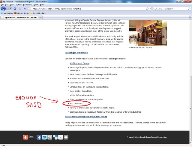
The only mention of ADA, accessibility, facilities for disabled people or services for travellers with special needs or anything remotely related to these things in the Houston Airport System website are their “passenger amenities” sub-sub-sections in each airport subsection.
After so much digging through sub-sub-sub-sections visitors are faced with the depressingly, ridiculously and insultingly short “ADA amenities” phrase and nothing else!
Yep, that is only two words (mentioned twice) about disabled people, wheelchairs, ADA, special needs, elderly people and so much more. Houston Airport System’s website developers surely are laconic (to the point of absurdity!).
Here are the links to those sub-sub-sub-sections so you can laugh (or cry) as much as you like (notice how very similar the pages’ content is 😛 ):
George Bush Intercontinental Airport: Terminal amenities
William P. Hobby Airport: Terminal amenities
By the way, in case you cannot find those two words in all that mess, here is a screenshot of William P. Hobby’s Amenities page for you below (words marked with red so you can find them):

If those two words are not insulting to any person with special needs browsing the 3-in-1 website of Houston Airport System’s airports, I don’t know what is. (Actually I do, that’s why I wrote America’s 10 worst airport websites.)
In conclusion, here’s why I included Houston Airport System’s 3-in-1 airports website in America’s 10 worst airport websites:
- Only two words worth of information on accessibility: “ADA amenities” (sic)! (actually there are four words since “ADA amenities” is mentioned twice LOL)
- Overstuffed website with not-so-useful information and self-promotional info.
- Website shared among three airports (George Bush Intercontinental Airport, William P. Hobby Airport and Ellington Airport), making browsing very confusing.
- Website is generally hard to navigate.
This is No.3 in our America’s 10 worst airport websites series
