America’s 10 worst airport websites: No.8 – Cleveland Hopkins International Airport
Cleveland Hopkins International Airport is the largest airport in the state of Ohio. It boasts many airport firsts, and it is considered a very important airport worldwide and all that stuff.
A little while ago, I was writing the article on Cleveland Hopkins International Airport (read it here).
I was a bit bothered by the tiny fonts and the grey-white contrast on some buttons that made the page hard to browse, but finding most information on their professionally designed website was fairly easy and straightforward…
Except that I could not find any accessibility info!
Oh yes, they might have sleek plug-ins and professional design but… but where was their accessibility info hidden?!
I had to use specialised search engine tools to find what little information on accessibility and services for passengers with special needs there was on Cleveland Hopkins International Airport’s official website. And when I found it I was struck by sheer absurdity!
Now before I continue, if you think I am exaggerating please by all means visit their official website’s home page and try to find their accessibility page. You will see what I mean rather quickly.
So here is the link to their accessibility web page:
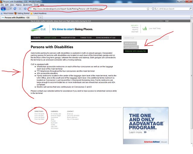
http://www.clevelandairport.com/Airport-Guide/Parking/Persons-with-Disabilities.aspx
Note that it’s under /Airport-Guide/Parking !
OK, so not only was the information fairly inadequate, but for some reason it was also MISPLACED AND HIDDEN under a sub-sub-section of the website about parking! Are you serious, people?!
So how the heck is the average person supposed to divine where that info is? There is no direct link, no indication or anything hinting that in order to find out if the airport has ADA-accessible elevators or text telephones, you must go through their parking sub-section!
It is obvious that whoever is responsible for this blunder designed the site without thinking how hard it would be for a disabled person (especially someone with visual impairment) to find their accessibility page.
The small fonts and the grey-white theme of many aspects of the site is a minor grievance, but the “riddle” url location of their accessibility page is plain insulting. (Not to mention its inadequate content.)
Here’s a screenshot of Cleveland Hopkins International Airport’s misplaced accessibility page with the bad points marked out in red:

Final words on why and how Cleveland Hopkins International Airport’s Website is unacceptable for me and why it made it into America’s 10 worst airport websites:
- Misplaced “Persons-with-Disabilities” web page, deeply buried in wrong sub-section makes it notoriously hard to find!
- No direct link to their accessibility web page (to be expected from the above, though!)
- Tiny grey letters on white background make the website even less accessible.
- Inadequate accessibility information.
- No directions or symbols in their terminal maps for any facilities for travellers with special needs.
This is No.8 in our America’s 10 worst airport websites series
